2012 team kit watch
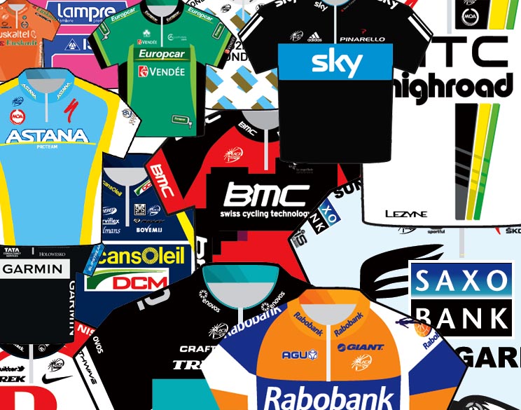

As the top teams host their official team presentations and return to competition, so we get a chance to see what they'll be wearing in 2012.
Some squads opt for maintaining a similar look to their team strip from one season to the next. Others prefer a more radical approach, re-designing their kit every year.
Cycling Weekly's fashion police are keeping a close eye on proceedings, and we'll be bringing you the latest pictures of 2012 team kit as soon as they're spotted.
We also invite you to comment and rate each team's kit. Which is your favourite? And which wouldn't you be seen dead in? Let us know in the comment box below...
Astana
Not a great departure for Kazakhstan's WorldTour team, they keep the national colours intact with a new typeface for the team name - all good. New co-sponsor Samruk-Kazyna, a Kazakh conglomerate, has its name on the shoulders and flanks. We've avoided using the publicity shots of Alexandre Vinokourov making some shapes because this is a family website. Instead, the charming Roman Kreuziger stands in front of a dodgy studio backdrop to show us Astana's colours.
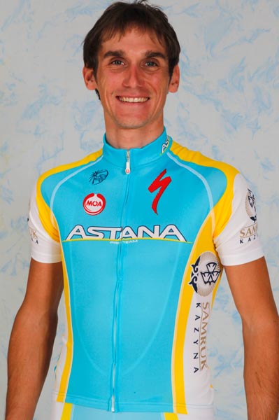
Photo: Graham Watson
Get The Leadout Newsletter
The latest race content, interviews, features, reviews and expert buying guides, direct to your inbox!
Garmin-Barracuda
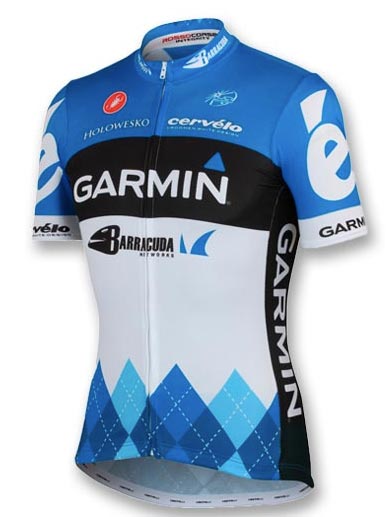
A welcome return to light blue, white and argyle for the American squad, now with a new co-sponsor in the shape of Barracuda Systems. The argyle influence seems to divide fans' opinion, but at least it's different from the pack.
RadioShack Nissan Trek
The newly amalgamated RadioShack Nissan Trek has gone for a disappointing re-working of the Leopard-Trek kit. Tour de France hopeful Andy Schleck is shown here in the 'new' strip. Most noticeable difference to the Leopard kit is that the front of the jersey actually has a sponsor's name on it, and the left cuff has a yellow LiveStrong band as per RadioShack/Discovery Channel jersey of old. Not nice, not nasty, just a bit bland. And the kit's not up to much either.

GreenEdge
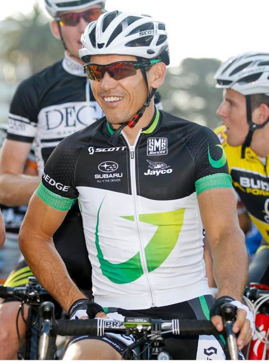
The new Australian outfit has opted for a fairly muted black/white design with the team's swooshy green G in the middle. They could have really gone to town on the whole green theme, but have obviously decided against the squad looking like Batman baddie, The Riddler. Disaster averted.
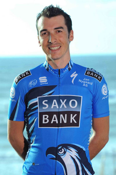
Saxo Bank
Moving away from the identikit black/light blue/white, Saxo Bank have gone for a darker blue theme this season. With former sponsor SunGard now gone, the Saxo Bank logo gets pride of place in an uncluttered design. The grumpy-looking tummy eagle is back, and it's still going to be the cause of jokes. But not by us, obviously. Did something say something about pecker?
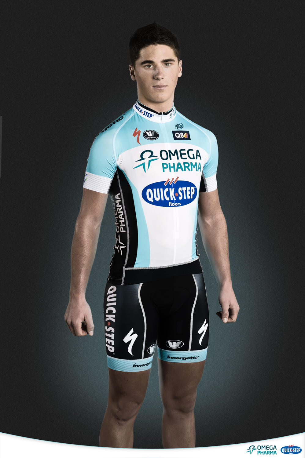
Omega Pharma-Quick Step
Belgian super team Omega Pharma-Quick Step has settled for a distinctly un-Euro, muted design with thankfully tasteful black shorts. It's a little bit on the dull side but no doubt they'll be wanting their results to outshine their kit design - eighth place on a stage of the Eneco Tour would probably do that.
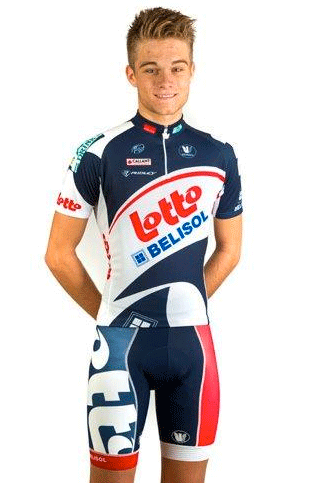
Lotto-Bellisol
This is more like it. A proper Euro design with bold graphics for the Belgian team. Lotto have gone for non-black shorts, which they just about, er, pull off but we really wouldn't like to see that red strip on the left leg go all the way down to the ankle on full-length tights.
Sky
Team Sky's regular blue, black and white kit hasn't changed much from last season, but it's worth us including a photo of Mark Cavendish's special world champion stripey strip here because... well, why not.

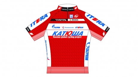
Katusha
The Russian team has gone for a bold red re-design for 2012 which may cause problems at the Vuelta a Espana, where it will look like the whole team is in the lead. Or that they are Cofidis.
Related links
Tour Down Under 2012: Cycling Weekly's coverage index

Thank you for reading 20 articles this month* Join now for unlimited access
Enjoy your first month for just £1 / $1 / €1
*Read 5 free articles per month without a subscription

Join now for unlimited access
Try first month for just £1 / $1 / €1

Nigel Wynn worked as associate editor on CyclingWeekly.com, he worked almost single-handedly on the Cycling Weekly website in its early days. His passion for cycling, his writing and his creativity, as well as his hard work and dedication, were the original driving force behind the website’s success. Without him, CyclingWeekly.com would certainly not exist on the size and scale that it enjoys today. Nigel sadly passed away, following a brave battle with a cancer-related illness, in 2018. He was a highly valued colleague, and more importantly, an exceptional person to work with - his presence is sorely missed.
-
 How do the pros train? Noemi Rüegg's 26 hour training week
Winner of this year’s Tour Down Under, the EF Education-Oatly rider is a climber whose talent is taking her to the top
By Chris Marshall-Bell
-
 Save £42 on the same tyres that Mathieu Van de Poel won Paris-Roubaix on, this Easter weekend
Deals Its rare that Pirelli P-Zero Race TLR RS can be found on sale, and certainly not with a whopping 25% discount, grab a pair this weekend before they go...
By Matt Ischt-Barnard