Around the Apeldoorn velodrome

The latest race content, interviews, features, reviews and expert buying guides, direct to your inbox!
You are now subscribed
Your newsletter sign-up was successful
Every velodrome is different, not just the track, but the architecture, layout, look and feel of the building that holds it.
Sadly, most velodromes live in functional buildings, constructed on industrial estates or on the outskirts of cities or towns. Very few inspire spectators to crane their neck and study the building as they approach. Some are little more than sheds.
The insides vary hugely, with the layout largely dictated by the number of seats the occupier thinks they can afford to live with. Very few velodromes hold over 4,000 seats for spectators these days, as not even hosting the world championships can guarantee capacity crowds.
Manchester velodrome is probably the only one in the world that regularly sells-out, but with only 3,500 seats and a world-beating home team it would be worrying if it didn't.
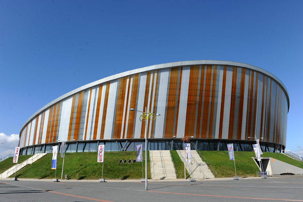
Apeldoorn's track surprisingly sits above the ground. The front of the building has a Paul Smithesque look with vertical stripes of various widths and colours.
This outer wall lets light through, flooding the building with natural light. Or at least it would if the inside wasn't covered with thick black curtains (see below). Service doors are at ground level as the track has been built up from the ground, rather than dug in to the ground to keep the building low.
The latest race content, interviews, features, reviews and expert buying guides, direct to your inbox!
The building has a bit of a lopsided feel to it with the front raised up. The front of the building (the highest point of the roof) is the back straight of the velodrome. From outside you'd think it would hug the banking, but the building doesn't mirror the shape of the track. That high roof allows for the large banks of seats that sit behind the back straight of the track.
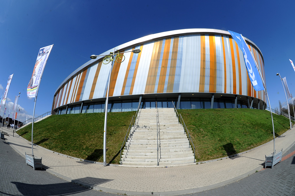
The main entrance to the building. As you'd expect in the Netherlands there are bike racks everywhere and the cycle paths lead right up to the door. Exactly how it should be done.
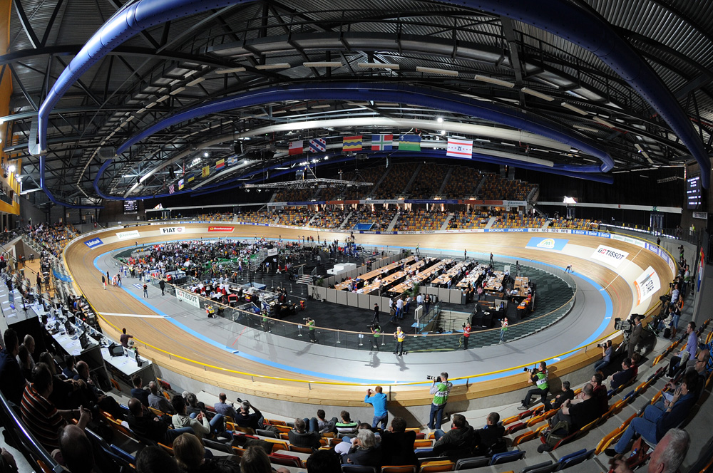
The inside of the building is quite disorientating. All the natural light is blocked out. (Supposedly the TV crews asked for that so the light was controlable. It makes it harder for the photographers though as some of the bright lights are constantly strobing, which confuses the cameras. The strobing is so quick it's not visible to the naked eye.)
The track feels round rather than long and thin. The straights are very short and the bankings much longer than the likes of Manchester or Newport track. This photograph doesn't show this effect that well. The desks in the middle is the media area, one of the biggest we've worked in for years.
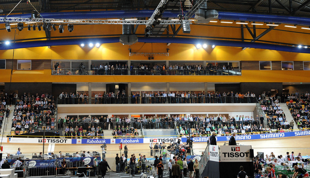
Adding to the disorientation is the feeling of being outside at night time, we can't quite put our fingers on why, but it could have something to do with the balconies above the finishing straight. They house bars for VIPs, but that part of the building (pictured below) looks like it's an outside wall.

The centre of the track is below the black line of the track, which helps visibility. The UCI is apparently asking for all championship tracks to be built like this to help judges and officials see the whole of the track from the centre. London is similar in this sense.

Taken with a fisheye lens, it's clear to see the high point of the roof. That glass, at concourse level, should also allow natural light in to the velodrome, but again it's blocked off by black curtains inside.

Related links
Track World Championships 2011: Cycling Weekly's coverage index
Founded in 1891, Cycling Weekly and its team of expert journalists brings cyclists in-depth reviews, extensive coverage of both professional and domestic racing, as well as fitness advice and 'brew a cuppa and put your feet up' features. Cycling Weekly serves its audience across a range of platforms, from good old-fashioned print to online journalism, and video.