British cycling team kit 2012
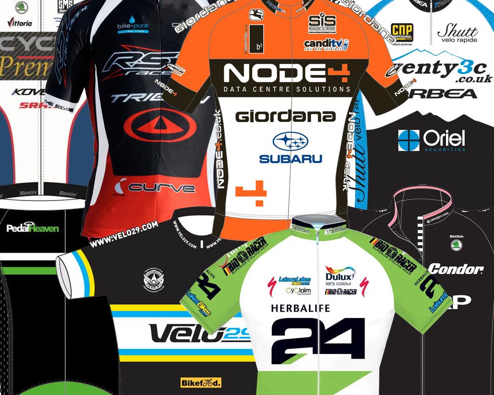

With the British race season about to kick off, we thought we'd round up a few of the top British teams' attire for the year ahead.
On the whole, British domestic squads have produced a very elegant selection of kit. It's a far cry from the Euro splurge on offer across the channel.
We invite you to comment and rate each team's kit. Which is your favourite? And which wouldn't you be seen dead in? Let us know in the comment box below...
Endura Racing Team
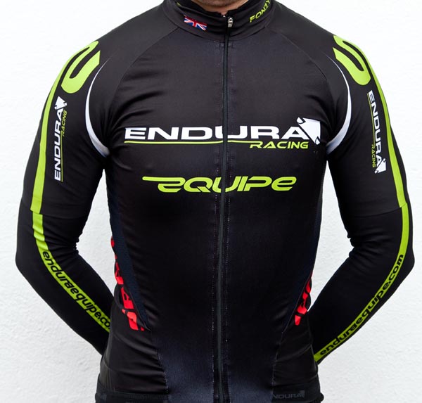
As one of the British teams to have made black kit cool, Endura has stuck to the winning formula with a few design tweaks for 2012. The lime green detailing now sweeps around the shoulders and down the arms, with the front of the jersey maintaining its clean, uncluttered design. Marvellous.
Web: http://www.enduraracing.com/
Raleigh-GAC
Get The Leadout Newsletter
The latest race content, interviews, features, reviews and expert buying guides, direct to your inbox!
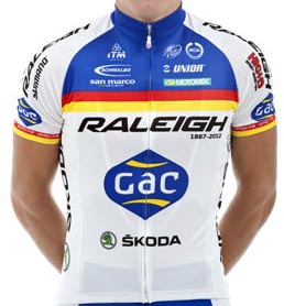
Enough of a nod to Raleigh's undeniable racing heritage yet modern enough to not look like it's trying too hard to be retro - this is a clever jersey design. New sponsor GAC gets pride of place in the centre of the chest.
Web: http://www.teamraleigh.co.uk
GWR team
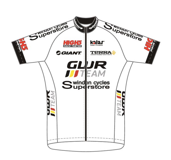
GWR has gone for more white this season, with an almost entirely white jersey. Thankfully, the whiteness stops at the waist, with tasteful black shorts finishing things off down below for the west country-based squad. As everyone knows, white shorts are just not on.
Web: http://www.gwrteam.com/
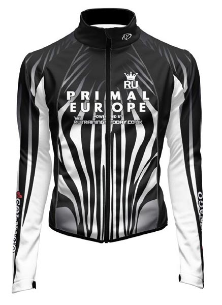
Team Primal
Zebra stripes are a fitting design for the 2012 Primal team, whose jerseys have often incorporated animal-themed designs over the years. It may be black and white and lacking in colour, but it's done in a Mario-Cipollini-good sort of way. We think.
Web: http://www.rutrainingtoday.co.uk/the-team
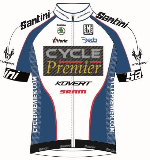
Cycle Premier
Cycle Premier has gone for a subtle rather than shouty colour-scheme, which only makes the faux carbon-fibre of the main chest logo stand out even more. All in all, it's a pretty tasteful jersey.
Web: http://www.cyclepremier.co.uk/
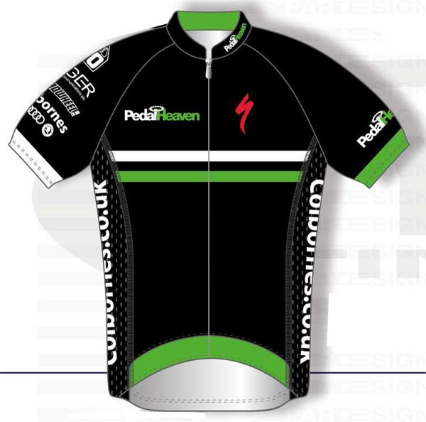
Pedal Heaven
Several British teams have gone for all-black kit in 2012. It's classy, sure, but does it stand out from the crowd? Not when everyone does it. Pedal Heaven brighten things up on their subtly-logoed version with some green detailing.
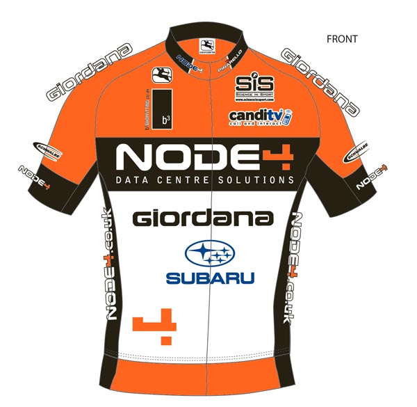
Node 4 Giordana
Born out of last year's Motorpoint team, the black, white and orange colour scheme remains with some nice bold logos to give those sponsors a big shout. And we like sponsors of British cycling teams, so we're all for big logos to give them some VFM.
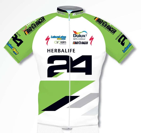
Herbalife Leisure Lakes
Classy-yet-modern design for Herbalife Leisure Lakes' 2012 strip, with some diagonal blocks doing the business in the bottom half.
Web: http://herbalifeleisurelakesbikes.com/
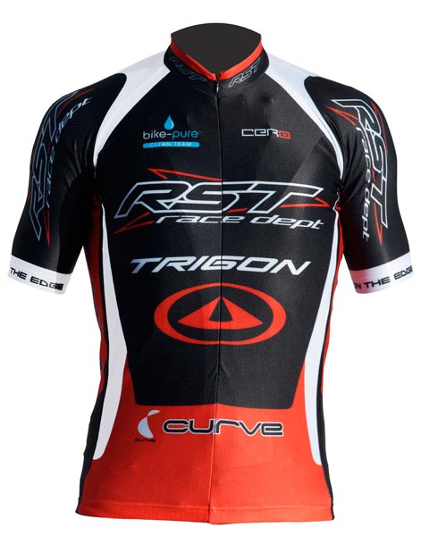
RST Trigon
There's something about the RST Trigon kit that looks fast. Maybe it's the slopey typefaces used in the main sponsors' logos, like they've been blown over by the slipstream from a passing super-speedy cyclist. Or something.
Web: http://www.rstracingteam.com
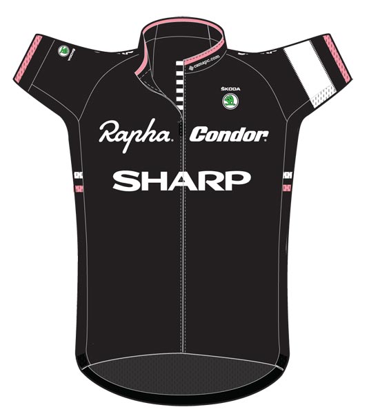
Rapha Condor Sharp
If it ain't broke, don't fix it. Rapha Condor Sharp stick with a slightly amended version of the distinctive black kit with pink and white details.Not quite as exclusive as it once was, as a couple of other teams have done something similar this season.
Web: http://www.raphacondor.cc/home
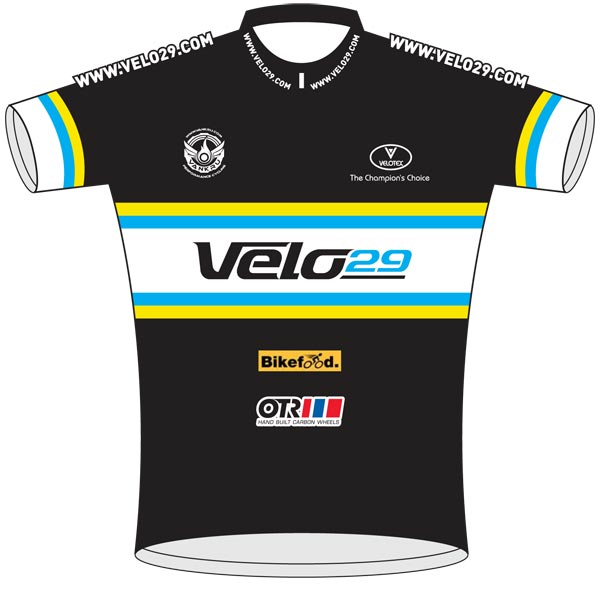
Velo 29
Velo29 have gone for a black background with horizontal strip across the front, the yellow and blue stripes stop it from being bland.
Web: http://www.velo29cyclingteam.co.uk/
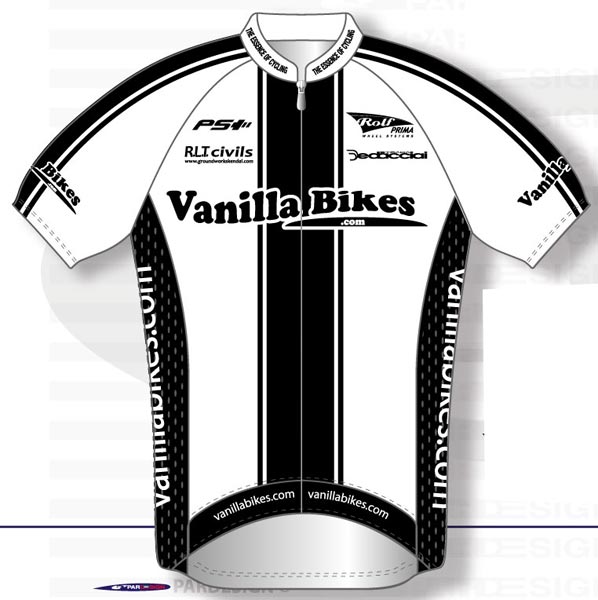
Vanilla Bikes
Vanilla bikes have thrown out the colouring pens on their design, sticking with white and black to make a statement. It's another clean and crisp design. Best to avoid muddy puddles with white kit, though.
Web: http://www.vanillabikes.com/
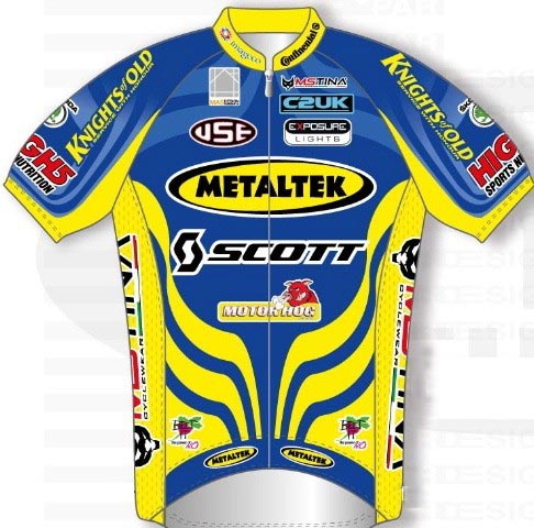
Metaltek-Scott
Now this one really will stand out in the peloton. Metaltek Scott have gone for primary yellow and blue with bold patterns on their jersey. Definitely not black.
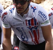
UK Youth
In two minds about the UK Youth kit - from the front the jersey is a bit plain, but from the back there's a big Union Flag on the rider's backside emblazoned with 'Wyndy Milla'. Anyone willing to ride with the word 'Wyndy' on their backside gets the thumbs-up from us. And the team is all about raising awareness of the worthy UK Youth charity too.
Web: http://www.teamukyouth.co.uk
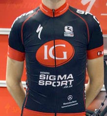
IG Sigma Sport
Sigma Sport's kit gets a neat redesign to relect title sponsor IG's involvement with the team. It's a neat looking kit, with black background and red details that wouldn't look out of place on the backs of a WorldTour-level team. Which should please new recruit Dan Lloyd.
Web: http://www.sigmasport.co.uk/news/teamIGsigmasport
Related links
2012 team kit watch

Thank you for reading 20 articles this month* Join now for unlimited access
Enjoy your first month for just £1 / $1 / €1
*Read 5 free articles per month without a subscription

Join now for unlimited access
Try first month for just £1 / $1 / €1

Nigel Wynn worked as associate editor on CyclingWeekly.com, he worked almost single-handedly on the Cycling Weekly website in its early days. His passion for cycling, his writing and his creativity, as well as his hard work and dedication, were the original driving force behind the website’s success. Without him, CyclingWeekly.com would certainly not exist on the size and scale that it enjoys today. Nigel sadly passed away, following a brave battle with a cancer-related illness, in 2018. He was a highly valued colleague, and more importantly, an exceptional person to work with - his presence is sorely missed.
-
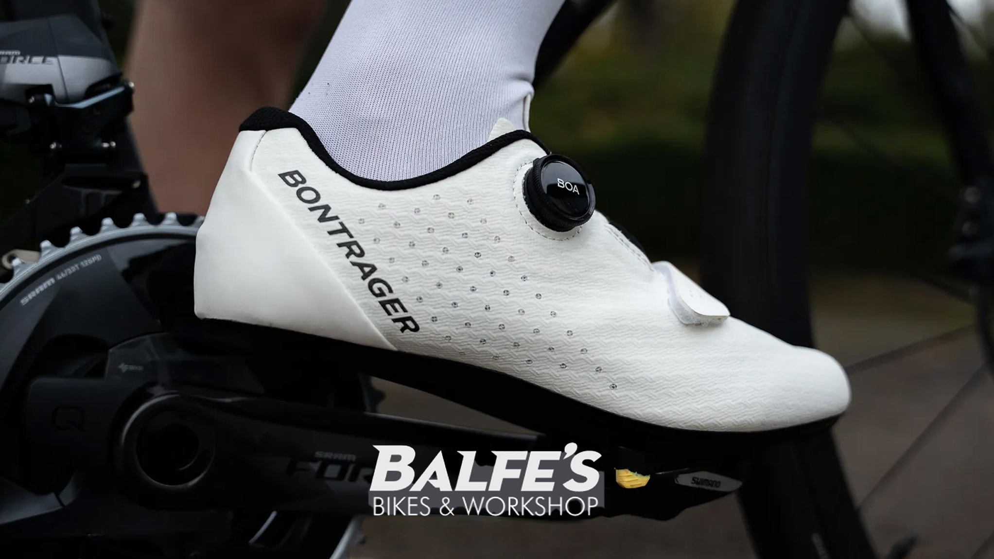 Gear up for your best summer of riding – Balfe's Bikes has up to 54% off Bontrager shoes, helmets, lights and much more
Supported It's not just Bontrager, Balfe's has a huge selection of discounted kit from the best cycling brands including Trek, Specialized, Giant and Castelli all with big reductions
By Paul Brett
-
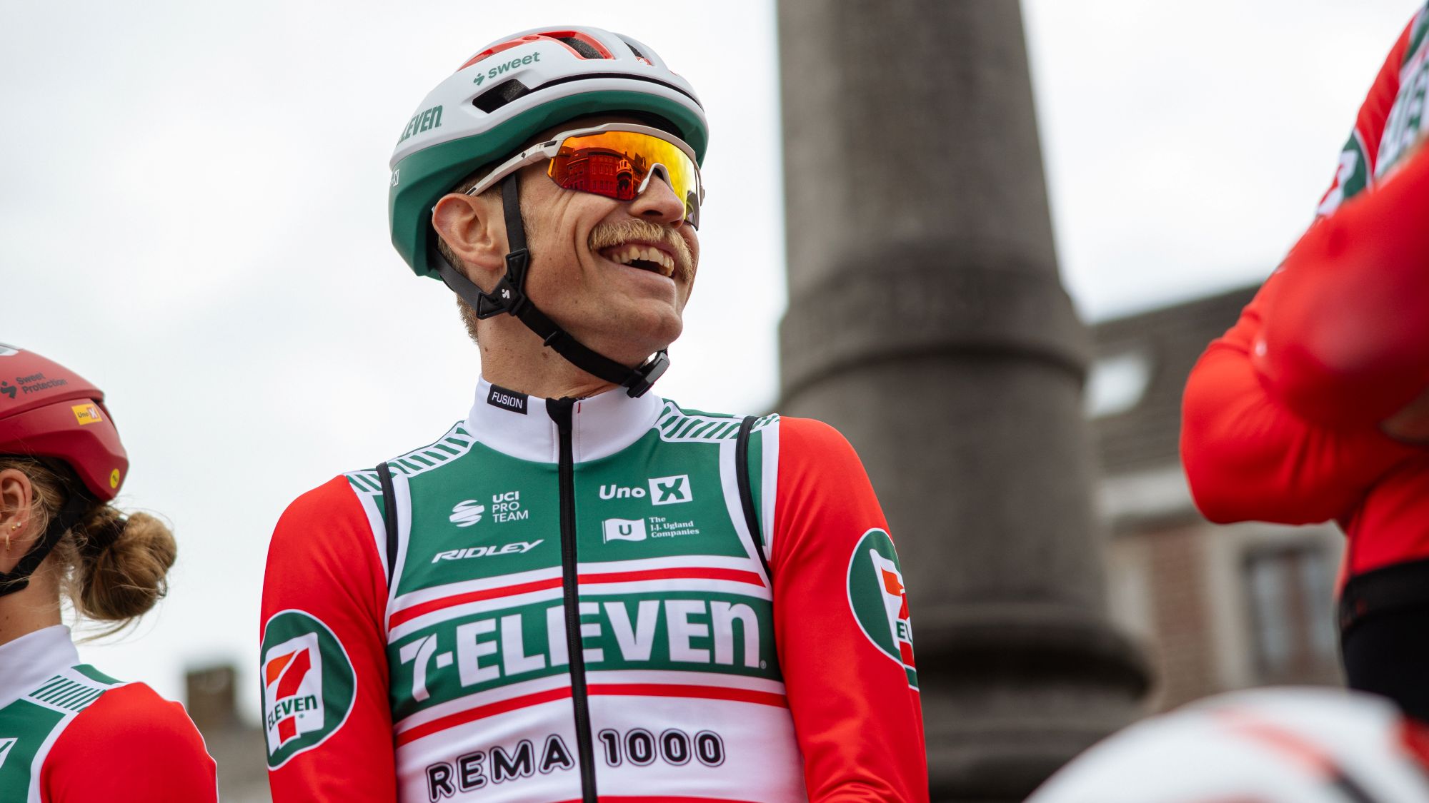 7-Eleven returns to the peloton for one day only at Liège-Bastogne-Liège
Uno-X Mobility to rebrand as 7-Eleven for Sunday's Monument to pay tribute to iconic American team from the 1980s
By Tom Thewlis