WorldTour team kits 2013: The good, bad and ugly
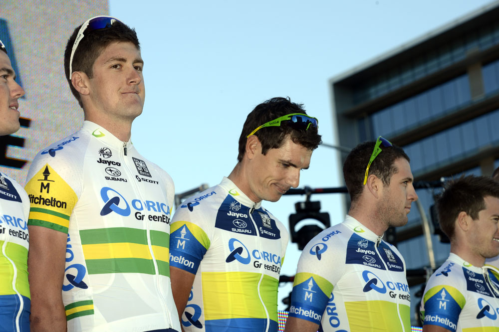
It's team launch time again... Ellis Bacon reviews the new season's collection of ProTeam kits and concludes that the only way to improve your jersey is to have your long-term main sponsor pull out.
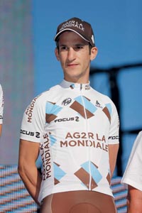
Ag2r La Mondiale
No great changes to this left-field kit for 2013, although no other team appears to have yet subscribed to Ag2r's insistence that brown shorts are the new black. There's still time.

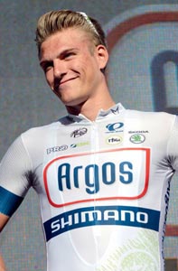
Argos-Shimano
New to the top flight, it might take some significant results to make anyone notice this understated kit. We can't remember ever having actually seen anyone wearing it outside of the pro ranks. Quite a nice jersey, though.

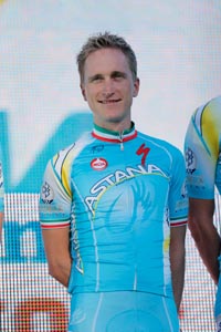
Astana
This jersey was due an update, and it's got one - albeit a minor one in the shape, quite literally, of a curvier Astana logo. Otherwise it's the same baby-blue hue and contrasting Specialized logos, while Alexandre Vinokourov remains at the helm.
Get The Leadout Newsletter
The latest race content, interviews, features, reviews and expert buying guides, direct to your inbox!


Blanco
Blanco's jersey is the newest, freshest design out there, having had a complete makeover since the team was Rabobank. That's because they lost Rabobank as their sponsor, which isn't the best way to get a new, fresh jersey.

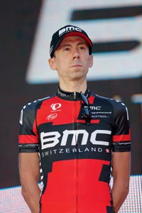
BMC
A slightly less ‘pixel-y' design improves this, but it's spiced up yet further thanks to some rainbow stripes on arms and collars as the team boasts no fewer than three past world champions, as well as current world champ Phil Gilbert.

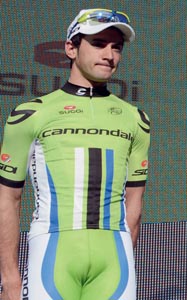
Cannondale
Now Liquigas-less, but boob-signing, Hulk-impersonating Peter Sagan is still the leading light. The Slovak national champion can be identified by his white, blue and red streaks in place of the others' white, black and blue.

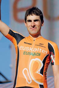
Euskaltel-Euskadi
Almost unchanged since 2000, the Euskaltel-Euskadi jersey has finally added some black accents to its otherwise garish orange, and suddenly become much more wearable outside of the Basque Country. And Holland.


FDJ
Still the peloton's whitest jersey (come on, Blanco!), FDJ appear to have dropped secondary sponsor Big Mat, which had caused some problems last year in French races where the main Big Mat team also appeared.


Garmin-Sharp
The sharp Sharp red stripes were added for the 2012 Tour, and the kit remains unchanged save for some extra argyle, which will please Scottish sock fans no end [that ‘joke' was used last year - Ed]. Still one of the best-looking kits.

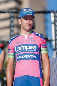
Lampre-Merida
Around this time of year, we have to look up how to spell fuchsia. Adding co-sponsor Merida for 2013 means that the jersey adopts the bike manufacturer's colours for the sleeves and collar, and is nothing short of a hot mess.

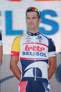
Lotto-Belisol
Yet another jersey that's remained unchanged save for an extra splash of colour - in this case a bit of yellow on one sleeve of new co-sponsor Telenet. It still isn't exactly top of our wish list.

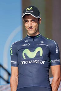
Movistar
Britain's Alex Dowsett has left the Sky blue and black behind and signed up to Movistar's navy and green for 2013. Good move - we think it'll really bring out his eyes.

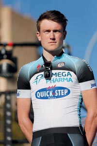
Omega Pharma-QuickStep
Boasting two of the sport's most bankable stars in the shape of Mark Cavendish and Tom Boonen means that this new jersey is going to fly off the shelves regardless of whether anyone actually likes it.

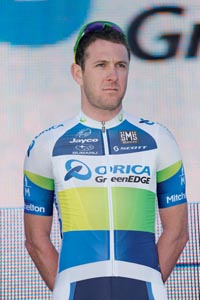
Orica-GreenEdge
The Aussies are more BlueEdged since adding Orica as main sponsor. Orica, we are informed by our Australian sources, is a mining company. "As in mine's a Foster's and a shrimp from the barbie?" we quipped. They didn't laugh.

RadioShack-Leopard
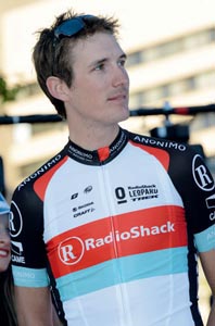
Not exactly team of the moment, thanks to problems with the Schlecks, and old ‘problems' with the likes of Johan Bruyneel and Lance Armstrong, now, mercifully, departed. But remember in the Armstrong days when the RadioShack jersey had a massive ‘R' logo on it? Thanks to sponsors Enovos and Nissan giving up on the team, it's heading that way again, as RadioShack could soon be the only sponsor left. As it is - very similar to last year's kit - it's actually quite a nice, clean design.

Saxo-Tinkoff
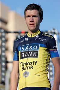
Dropping the ‘Bank' of Saxo Bank and Tinkoff Bank from the team's name does not mean it was dropped from the jersey. As a result, there is still no room for a return of the infamous ‘pant eagle' of 2011.


Team Sky
Now, this isn't us coming over all patriotic - even though us Brits have every reason to be on the back of 2012 - but this is very nicely done. The design is in keeping with Sky's mean 'n' moody black and blue identity, while also being unmistakably Rapha, which has taken over kit rights from Adidas. We'd wear one of these. We just can't afford it.

Vacansoleil-DCM
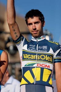
Here's another jersey that hasn't changed very much, either: Vacansoleil keep the usual blue and yellow, with a little less white than before. We're expecting better for 2014, chaps.

The original version of this article appeared in the January 24 2013 issue of Cycling Weekly magazine

Thank you for reading 20 articles this month* Join now for unlimited access
Enjoy your first month for just £1 / $1 / €1
*Read 5 free articles per month without a subscription

Join now for unlimited access
Try first month for just £1 / $1 / €1
Founded in 1891, Cycling Weekly and its team of expert journalists brings cyclists in-depth reviews, extensive coverage of both professional and domestic racing, as well as fitness advice and 'brew a cuppa and put your feet up' features. Cycling Weekly serves its audience across a range of platforms, from good old-fashioned print to online journalism, and video.
-
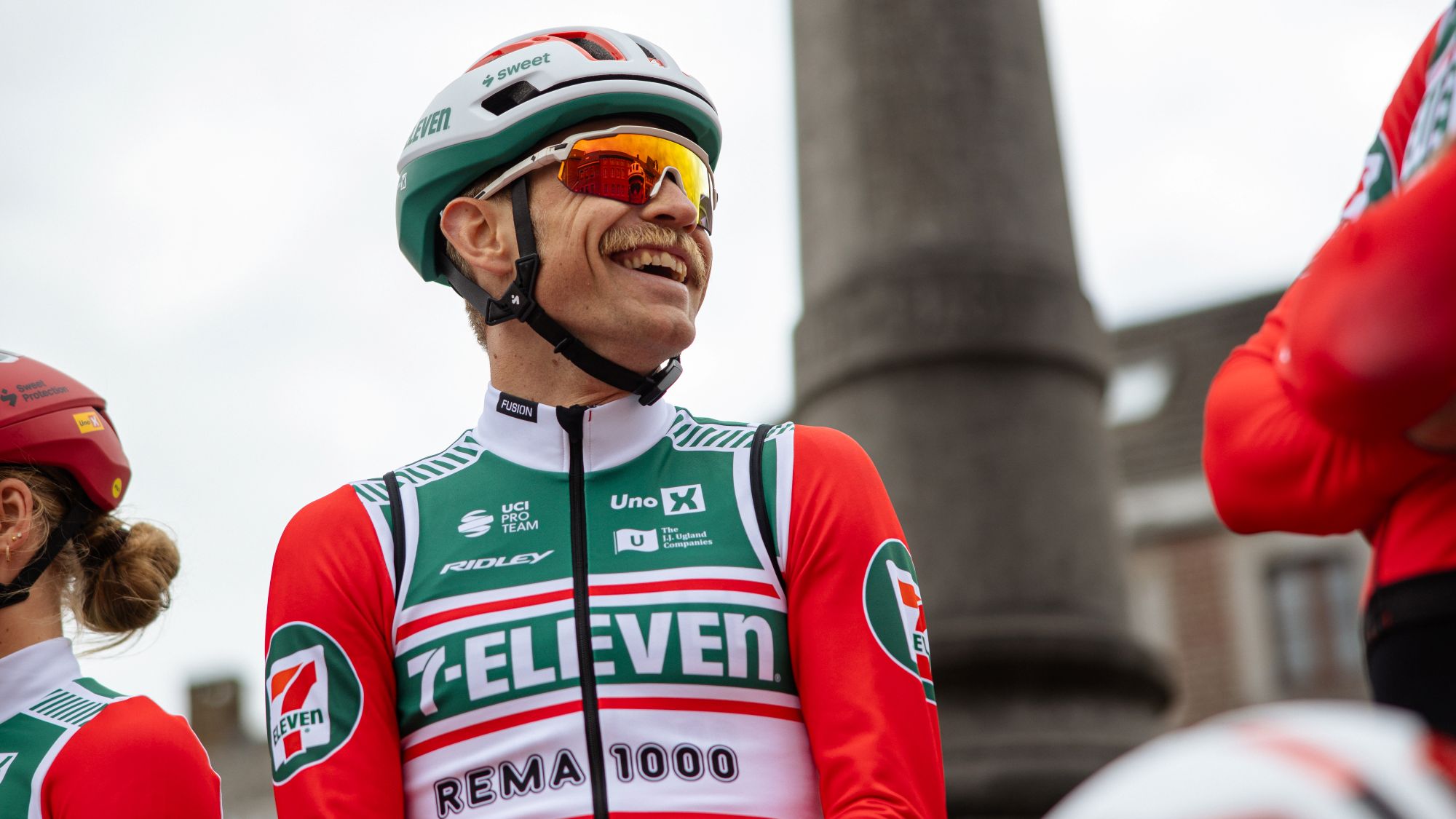 7-Eleven returns to the peloton for one day only at Liège-Bastogne-Liège
Uno-X Mobility to rebrand as 7-Eleven for Sunday's Monument to pay tribute to iconic American team from the 1980s
By Tom Thewlis
-
 Rapha launches the Super-League, a new British road racing points competition
16 events make up the Rapha Super-League, including crits and road races, with overall winners crowned
By Adam Becket