Which pro team has the best jersey? Cycling Weekly's pro kit awards 2025
From bold and brassy to cool and classy, we bring you this year's most memorable designs in the pro peloton

The 2025 season is very much underway, even if the biggest names are yet to grace the stage - next week even sees the UAE Tour begin, the second WorldTour race of the year. As a result, you are probably already getting used to the new colours and designs of the peloton, from the wacky to the similar.
You're getting used to new riders in different kits, and you're doing things like thinking 'aren't there a lot of women's squads in purple?' and trying to work out what really is different about this year's Groupama-FDJ or Ineos Grenadiers squads.
Having detailed all of the kits for 2025, we thought it was high time to take a deep dive into the best - and some of the more dubious - offerings from this year. If we've missed any, or you think we couldn't be any more wrong, then do comment below.
Best in show - our overall winners for 2025
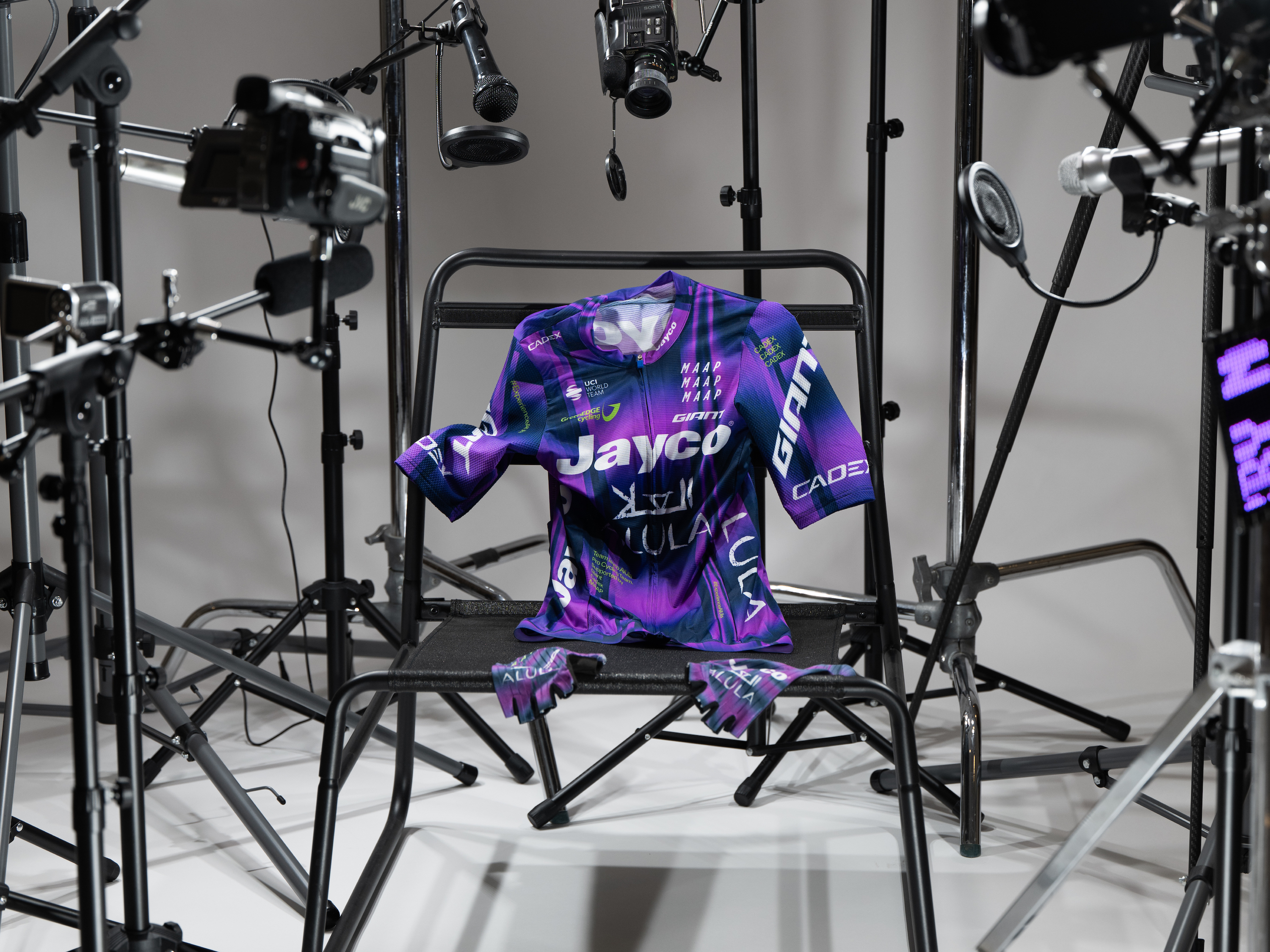
Winner: Jayco-AlUla
Jayco-Alula have never been particularly cool. They’ve been successful, they are very Australian, but there has been something missing from the team. A collaboration with homegrown clothing company MAAP, one of the coolest cycling brands, then, goes some way to mitigate that. The kit itself does something quite hard in the world of cycling: it stands out. The purple is inspired, and unique – in the men’s peloton, anyway. It’ll be paired with grey shorts to add a bit more spice to a largely black and navy bunch. AB
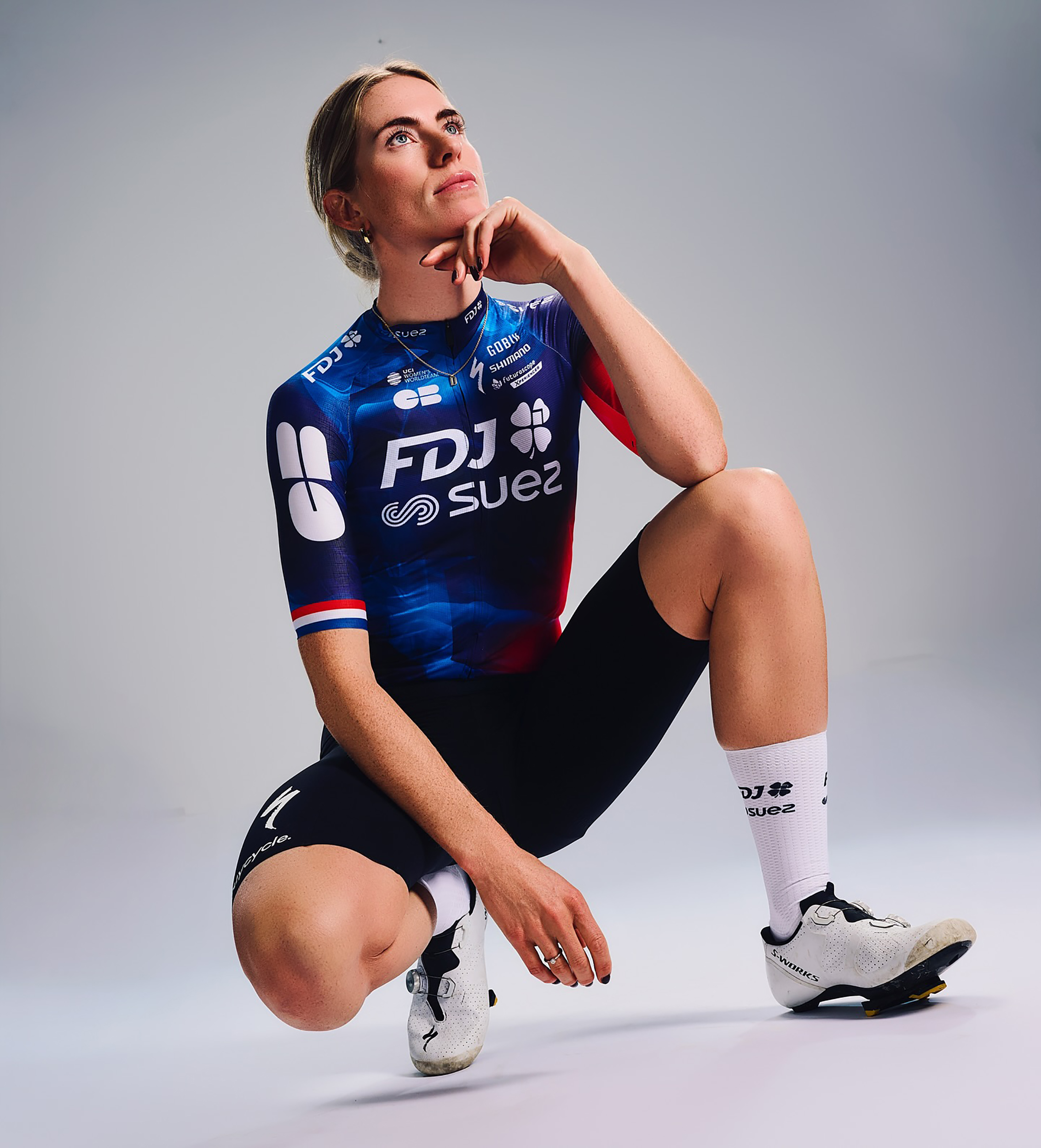
Runner-up: FDJ-Suez
Crowned the best kit by CW last year, the FDJ-Suez kit for 2025 is much the same, and it’s still so classy. Without trying particularly hard, the women’s WorldTour team oozes style, as seen in the press shots of Évita Muzic wearing the jersey with a pair of jeans – très chic. Based on the French tricolor, it’s just a debonair way of combining red, white, and blue. The team will hope it’ll be very successful on the shoulders of Demi Vollering. AB
The latest race content, interviews, features, reviews and expert buying guides, direct to your inbox!
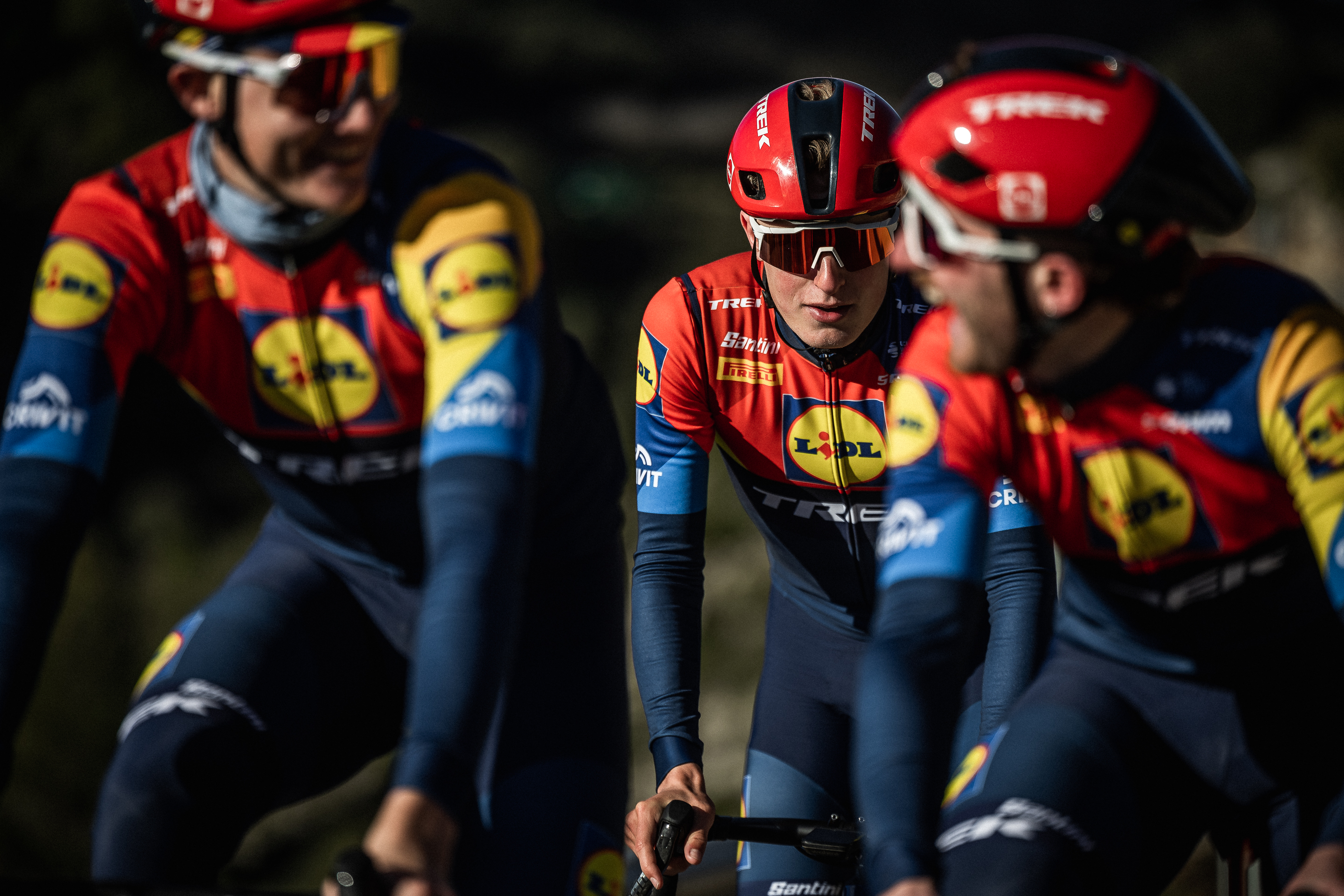
Special mention: Lidl-Trek
Lidl-Trek missed out on last year’s awards because they were still wearing the threads they announced at the 2023 Tour de France. This time around, they’ve mixed things up. The fun combination of yellow, blue and red of Lidl remains, just in a slightly different pattern. If you like primary colours, this is the kit for you. The team are certainly noticeable, which the sponsors will be thankful for. If only the kit was on sale in Lidl for £12.99, we’d all be snapping them up. AB

Before cycling took over his professional life, he covered ecclesiastical matters at the world’s largest Anglican newspaper. Don't ask how that is related to riding bikes.. He has never studied fashion or design.
Classy understatement award - for elegance and simplicity
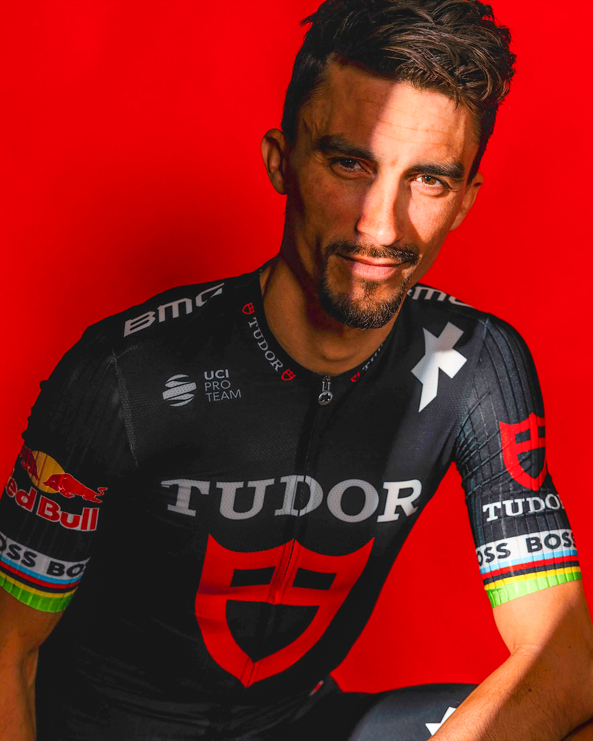
Winner: Tudor
The smart black jersey that ProTeam Tudor is rocking this year lands them the Classy Understatement award for 2025. The red emblem of Tudor watches’ logo finishes it all off nicely, with ‘Tudor’ etched in white. A strong look for the likes of Julian Alaphilippe and Marc Hirschi, and one that we should expect to see at the sharp end of one-day races across Europe this coming season. TT
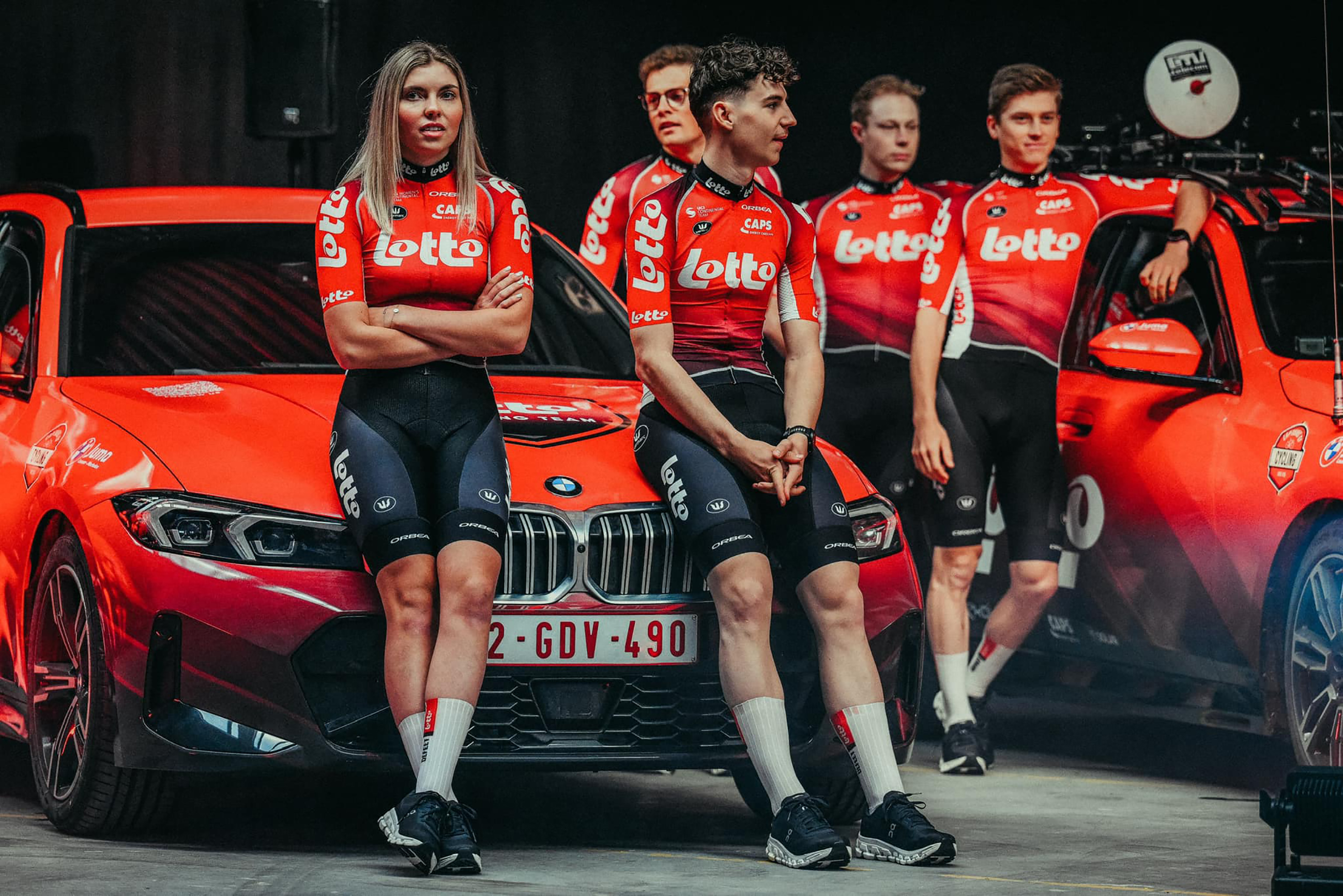
Runner-up: Lotto
They may be a second-tier team nowadays, but Lotto are the bona fide Classics kings of old, and this kit harks back to the Belgian team’s glory days. The red colour palette of the jersey is pure nostalgia and effortlessly cool – it will no doubt get a moment or two in the limelight should Arnaud De Lie get his hands in the air this spring. The jersey is said to represent the 40th year of the Belgian national lottery sponsoring one of the most recognisable and iconic teams in cycling. TT
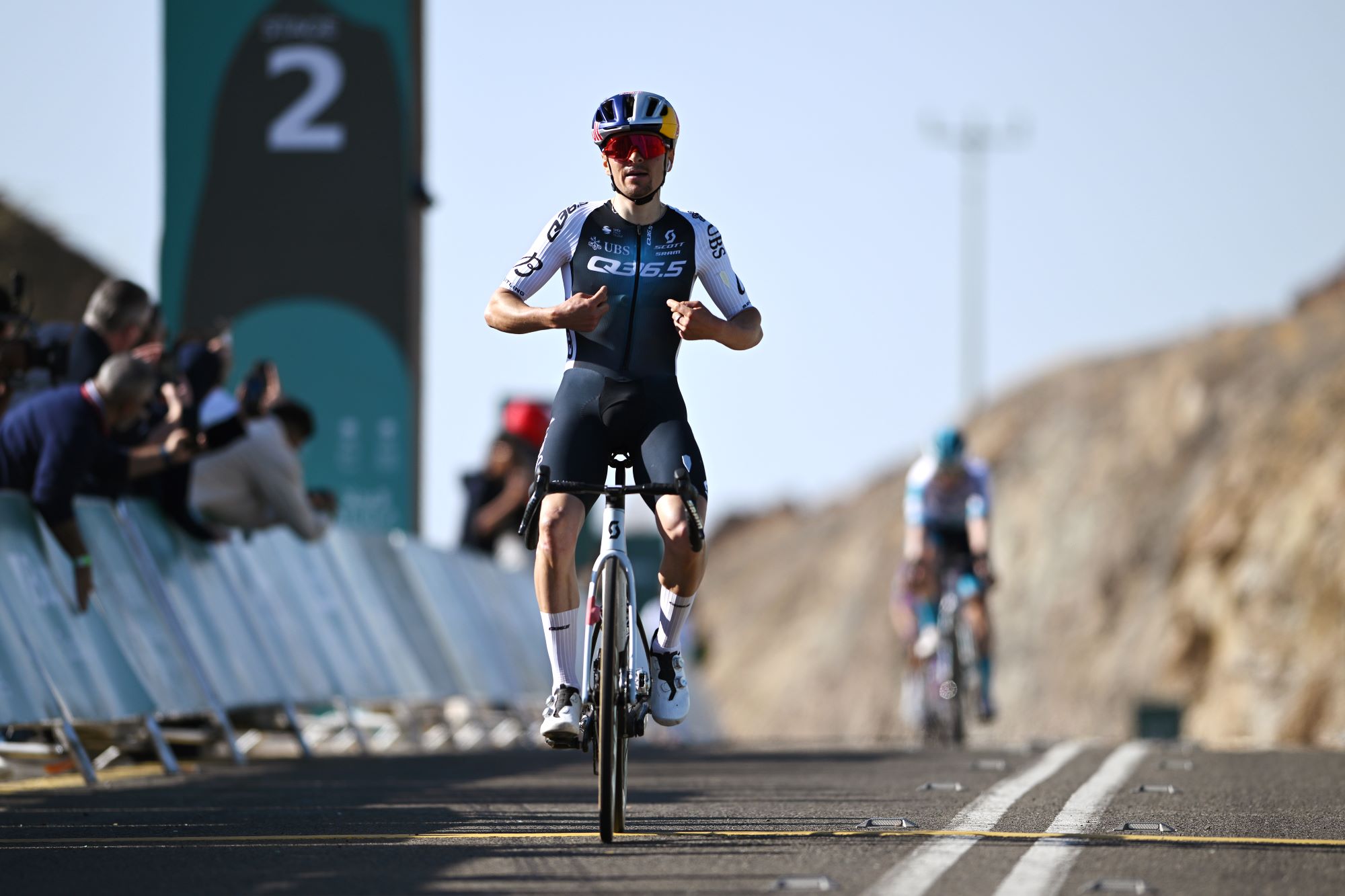
Special mention: Q36.5
The new white, blue and black colourway from Q36.5 ticks every style box as the team faces the new season with star signing Tom Pidcock, who will be joined on its roster by brother Joey. A strong change from the Swiss team’s previous getup, the new kit keeps it simple with black shorts and white socks to ensure they’ll look sharp all year round. TT

Tom has been writing for Cycling Weekly since 2022 and his news stories, rider interviews and features appear both online and in the magazine. He has never studied fashion or design.
Bold and brave award - recognising fearlessness in design
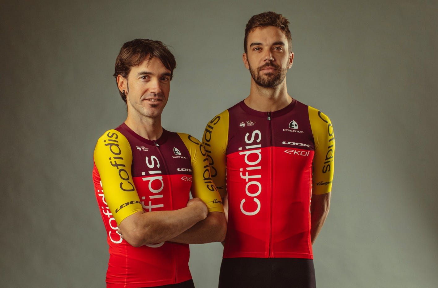
Winner: Cofidis
Cofidis have ramped up their colour palette this season with an unintentional ode to the Wetherspoon’s condiments rack. The team’s familiar ketchup red still takes prime place, but now it’s joined by a purple bralet, in the same hue as a bottle of Sarson’s vinegar. The pièce de résistance, however, is the mustard sleeves, a yellow so lively it adds a Dijon-esque spice to the look. This kit is best paired with a bowl of frites and a bottle of Kronenbourg. TD

Runner-up: Canyon-SRAM Zondacrypto
If you looked at Canyon-SRAM Zondacrypto’s updated jersey for 2025 and thought, ‘Wow, that really mimics the energy fl ow that riders experience in a bike race’, then congratulations, you’ve tapped into the ‘Infi nitum’ vision of its designer McKenzie Sampson. What we see, though, is an electric mind map of an acid trip. Picture Coldplay playing Woodstock ’69, except this is by no means all yellow. TD
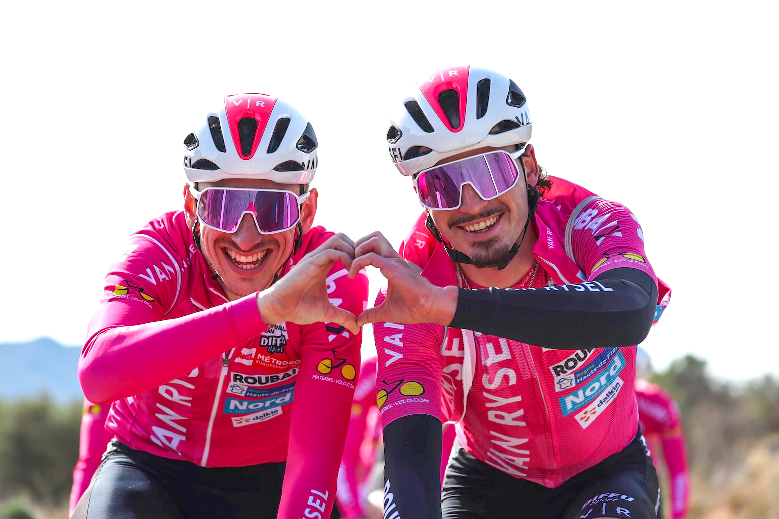
Special mention: Van Rysel-Roubaix
The riders of French Continental team Van Rysel-Roubaix will don a dashing pink in the peloton next year, as they set out to represent cycling’s cobbled heartland. There’s no doubt they’ll stand out. Still, we’re not sure about the wonky, crammed placement of the sponsor logos, glued like rock band stickers on the back of an angsty teenager’s laptop. It’s giving less Roubaix, more Green Day. TD

Tom likes it most when the road goes uphill, and actively seeks out double-figure gradients on his rides. He has never studied fashion or design.
Corporate overload award - best cramming on of logos
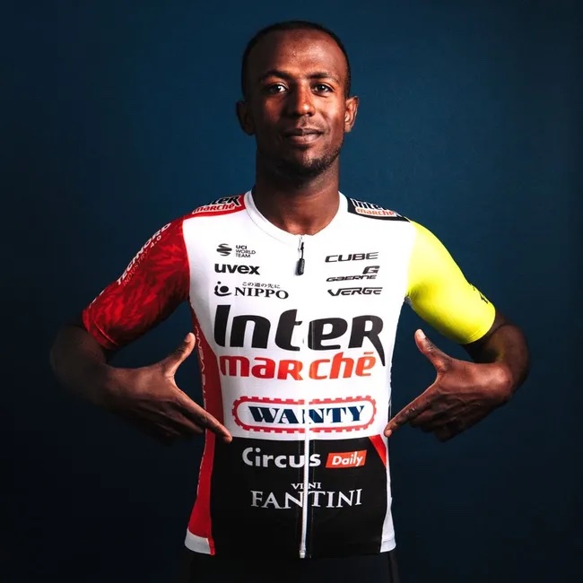
Winner: Intermarché Wanty
What’s the collective noun for a chaotic bunch of sponsor logos on a jersey full of apparently random colours? Ah, there isn’t one, you say? Well, there is now. If you’re of a sensitive disposition, we’d advise you don’t stare too long at Intermarché’s bedlam of branding (for how else could you describe it?) and inglorious technicolour, lest you fi nd yourself gripped by a nauseated panic and have to take a long lie down in a dark room. Personally, as someone with enough grey hair to remember the 1980s, it takes me back on a soothing nostalgia trip to a time when questionable kits were as common as brilliant ones. JS
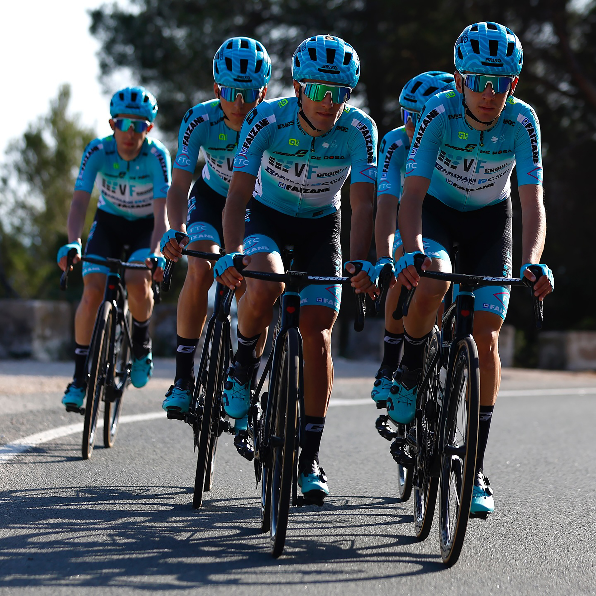
Runner-up: VF Group-Bardiani CSF-Faziané
Here we have the team that every journalist dreads writing about, unless they need to pad out their copy. It’s nothing personal against this Italian ProTeam, simply the amount of characters it takes to commit its moniker to the page. It stands to reason they would feature here in our kit guide, under this particular heading. Perhaps almost incongruously, the kit features a perfectly measured use of colour with its baby-blue and white combo. Sadly, it feels like the designer lost heart at this point, and scattered the logos across the jersey like sponsorship confetti. JS
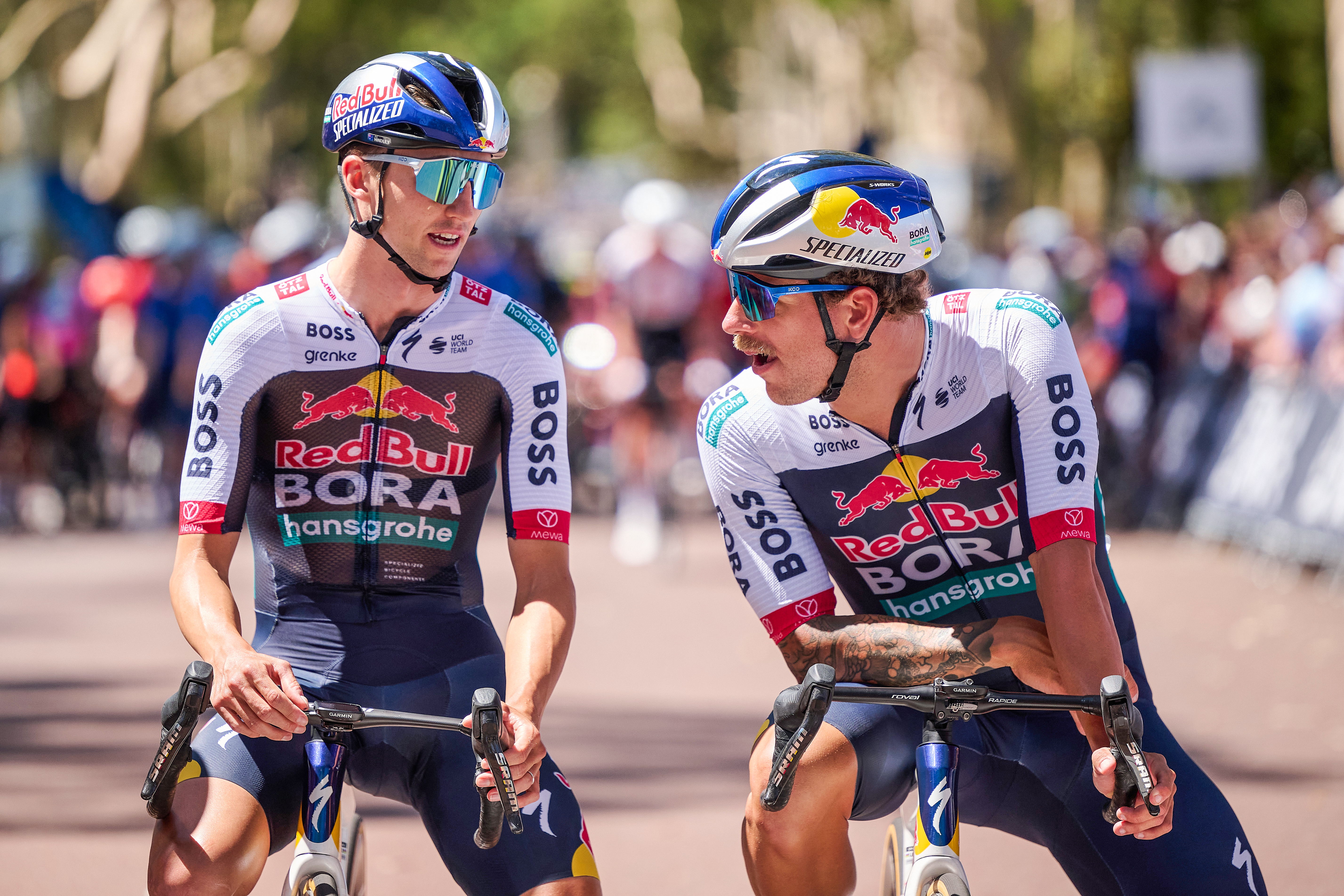
Special mention: Red Bull-Bora-Hansgrohe
You’ve heard the phrase ‘like a bull in a china shop,’ right? Now picture two bulls fighting in a showroom for kitchen and bathroom appliances. That’s this team jersey in a nutshell. No one messes with those raging bulls with their 51% controlling stake in the team, hence their pride of place at the top. Who could show them who’s Boss? Certainly not Hugo – he’s languishing on the sleeves. DB

A lifelong cyclist and cycling fan, James's racing days (and most of his fitness) are now behind him. But he still rides regularly, both on the road and on the gravelly stuff. He has never studied fashion or design.
Marmite award - You'll either love it or hate it
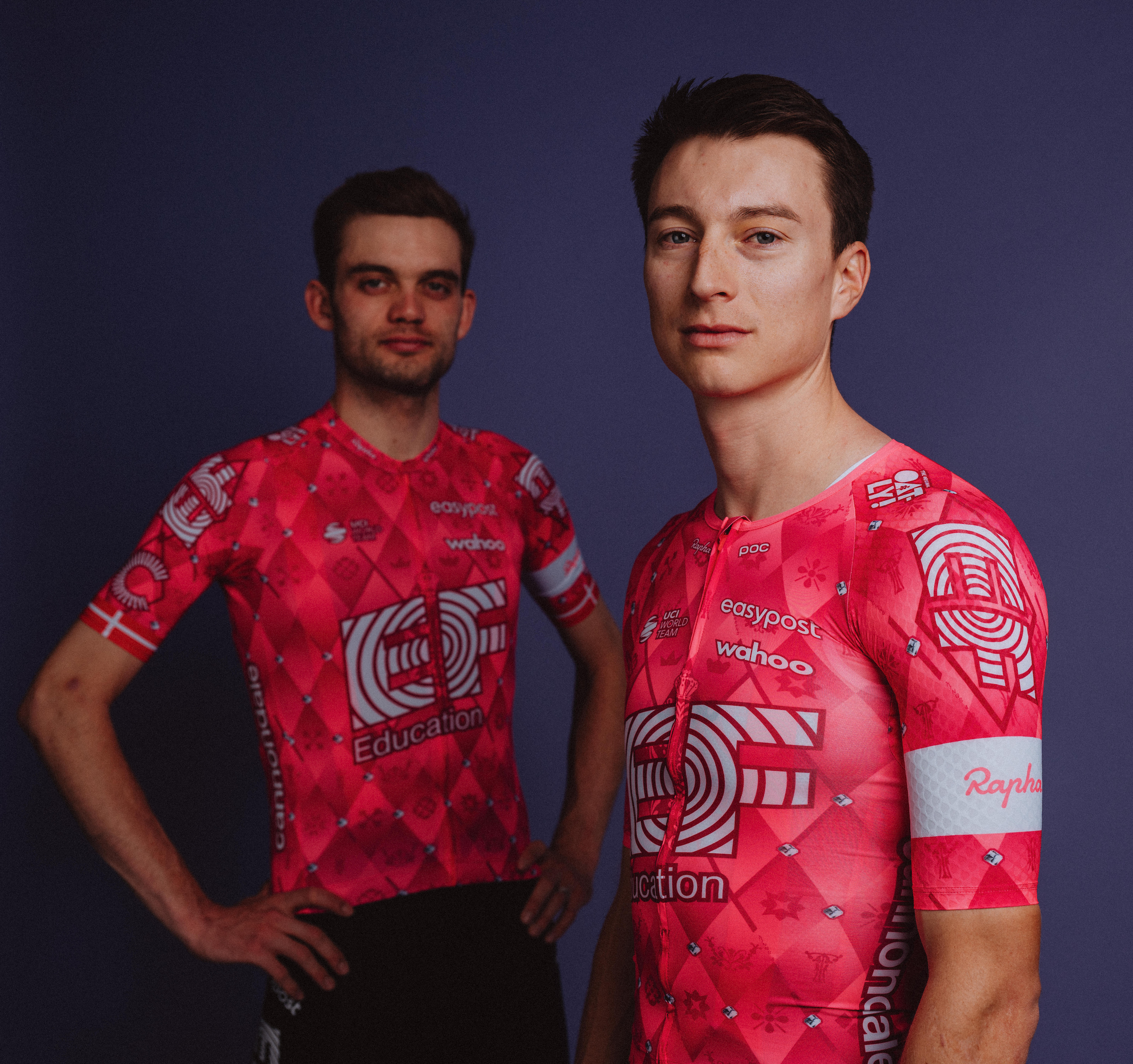
Winner: EF Pro Cycling
EF Pro Cycling has, once again, prioritised boldness and pinkness. But, ever the thrower of curveballs, it has now also bejewelled its jersey with printed diamonds. The saying goes that the gems are made under pressure, just like that faced by a rider in a race, or a kit designer told to fathom something original. We’re torn on the diamonds – touch of class or tacky gimmick? You decide. TD
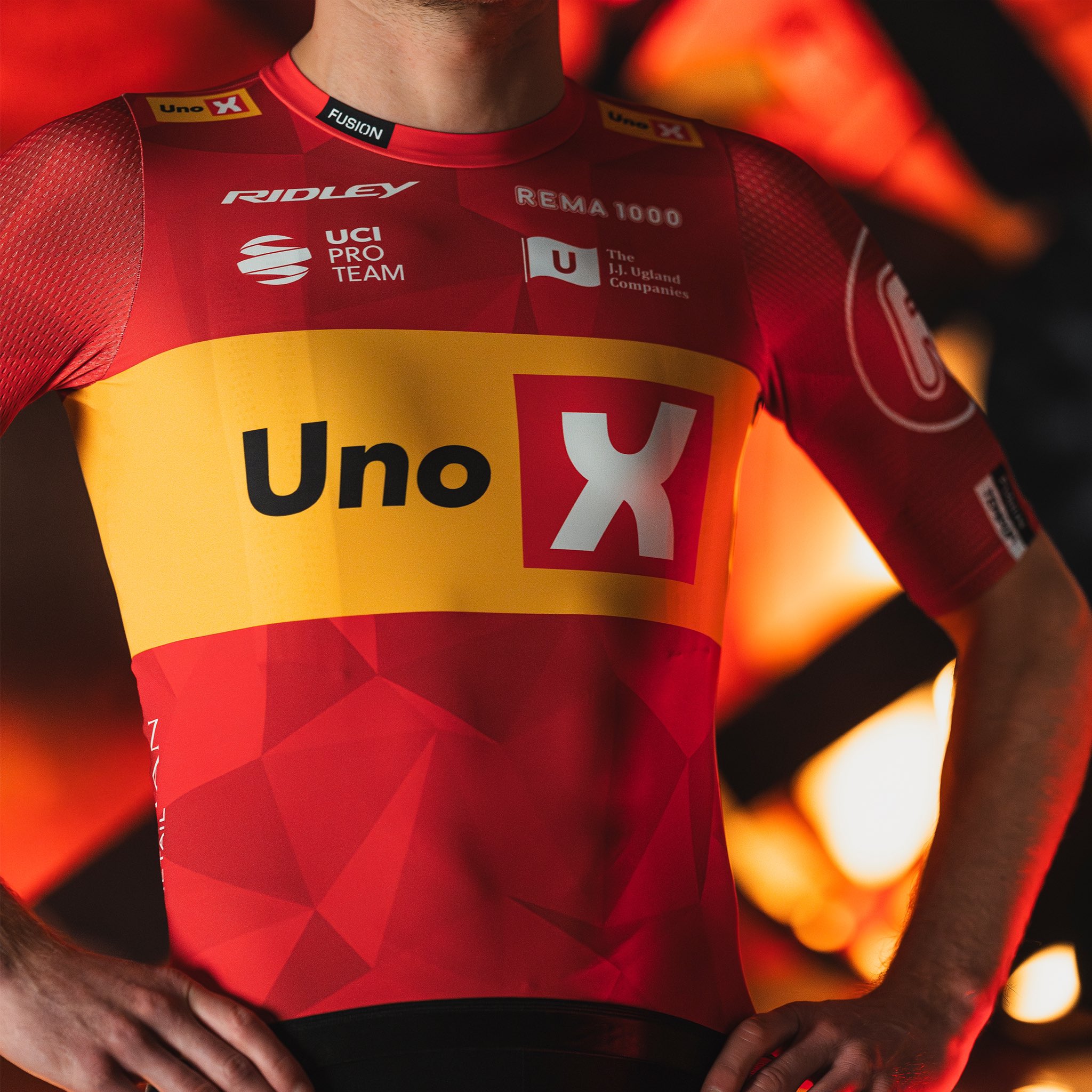
Runner-up: Uno-X Mobility
Can you spot something peculiar about Uno-X’s new jersey? Here’s a clue: if you’re the sort of rider who bares their chest on a warm day, ask yourself how you’d do it wearing this. That’s right, you can’t. There’s no zip. Made by Danish brand Fusion, Uno-X’s new offering is neat, slick, but looks more like something Michael Phelps might wear. Don’t expect to see it much in races – the team’s riders will mostly opt for full skinsuits, which are impossible to squeeze into without a zip. TD
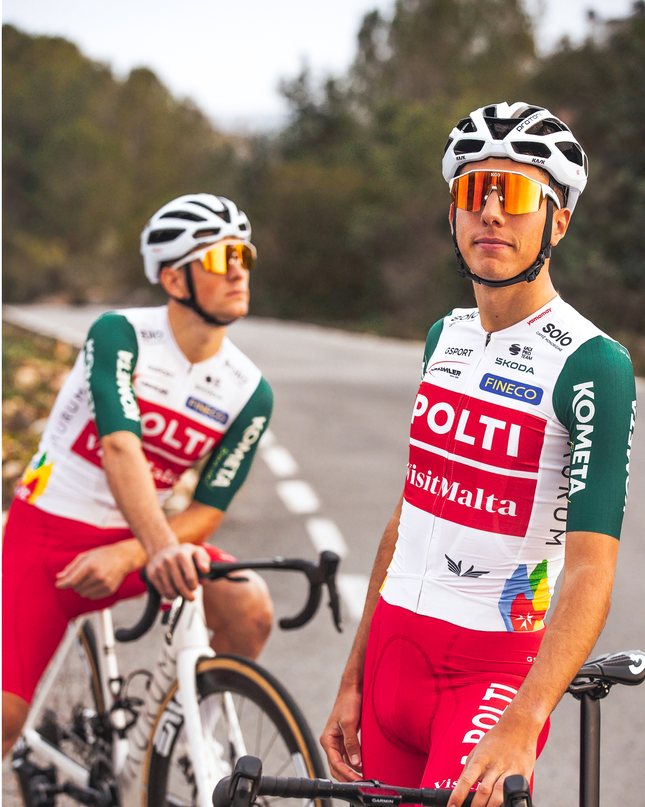
Special mention: Polti-VisitMalta
The Polti team of the Nineties rocked wild animal print, and they’re still bold beasts – red shorts are strictly for the cocksure only. The jersey remains two big blocks of colour, both red now, in honour of new sponsor VisitMalta. So arty it’s as if Mark Rothko turned his hand to selling ad space. DB
Alongside his love of cycling, David is a long-distance runner with a marathon PB of two hours 28 minutes. He has never studied fashion or design.
This feature originally appeared in Cycling Weekly magazine on 30th January 2025. Subscribe now and never miss an issue.

Thank you for reading 20 articles this month* Join now for unlimited access
Enjoy your first month for just £1 / $1 / €1
*Read 5 free articles per month without a subscription

Join now for unlimited access
Try first month for just £1 / $1 / €1

Tom joined Cycling Weekly as a news and features writer in the summer of 2022, having previously contributed as a freelancer. He is fluent in French and Spanish, and holds a master's degree in International Journalism. Since 2020, he has been the host of The TT Podcast, offering race analysis and rider interviews.
An enthusiastic cyclist himself, Tom likes it most when the road goes uphill, and actively seeks out double-figure gradients on his rides. His best result is 28th in a hill-climb competition, albeit out of 40 entrants.
You must confirm your public display name before commenting
Please logout and then login again, you will then be prompted to enter your display name.


